Preview image. Unlock full-res
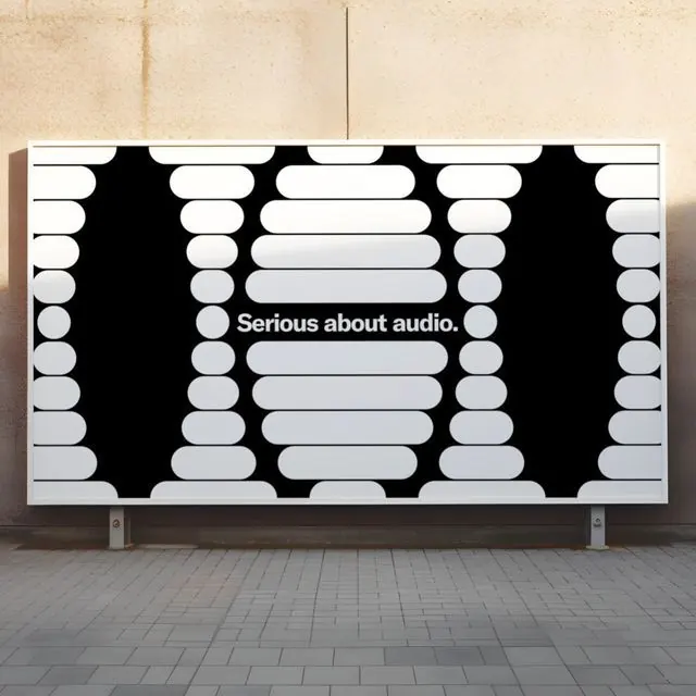
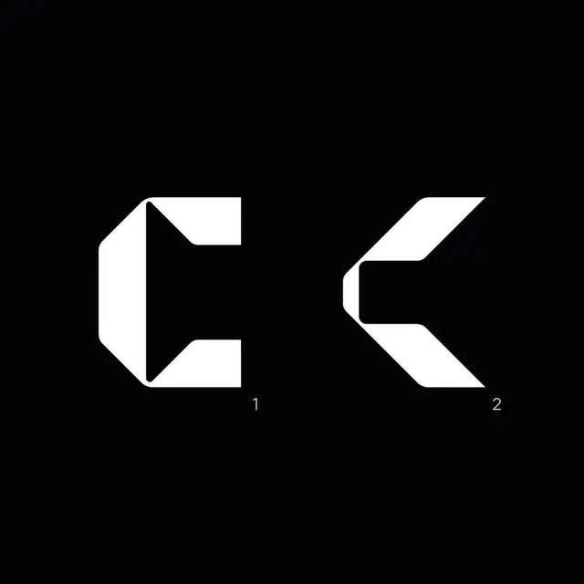
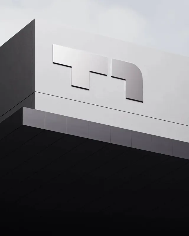
A monochrome logomark reading as an M, formed by one solid vertical bar followed by four progressively smaller vertical ellipses that recede left to right, suggesting motion, sound waves or depth.
Summary
A monochrome logomark reading as an M, formed by one solid vertical bar followed by four progressively smaller vertical ellipses that recede left to right, suggesting motion, sound waves or depth.
Visual description
Centered on a light warm-gray ground. A thick black rounded-rectangle pillar anchors the left; immediately to its right, four standalone capsule ellipses step down in both height and width, with the gaps between them widening toward the right to accelerate the rhythm. Each ellipse gets noticeably narrower. A small registered-trademark circle in black sits at the upper left corner of the main bar, the only secondary detail. No wordmark, no color variation, just solid black on near-white creating high graphic contrast.
Key takeaway
Imply motion or recession in a static mark by repeating one shape and shrinking it on a smooth curve; the eye reads the perspective without perspective tricks or gradients. The transition from solid form to detached slivers transforms a plain letter M into a distinctive, memorable icon.
Reuse notes
A clean reference for audio, motion, media or hardware brands where sound, signal or speed suits the identity. The receding-ellipse device animates beautifully, so it pairs well with brands that have motion components. Use as single-color only; test as knockout before considering any color variation.