Preview image. Unlock full-res
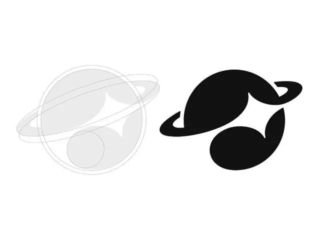
A side-by-side logo study shows a light outline version on the left and a solid black version on the right.
Summary
A side-by-side logo study shows a light outline version on the left and a solid black version on the right.
Visual description
The image contains two versions of the same abstract symbol placed side by side on a white background. The left version is a pale gray construction-like outline, while the right version is a filled black mark with a circular body, curved ring, and smaller detached shapes.
Key takeaway
The strongest move is the contrast between a delicate outline construction and a finalized solid mark. That makes the form read as both a process sketch and a finished identity system.
Reuse notes
Use this approach when presenting logo exploration or showing evolution from draft to final mark. It works well for identity presentations where you want to emphasize geometry and reduction.