Preview image. Unlock full-res
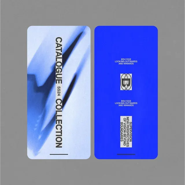
Two vertical fashion catalogue cards: a soft-blue motion-blur front with black all-caps type rotated 90 degrees, and a saturated royal-blue back with centered stacked captions and an outlined monogram.
Summary
Two rounded-corner vertical cards with coordinated color and typography: a light-blue front featuring a draped motion-blur image with rotated all-caps labeling, and a royal-blue back showing centered text and a symmetrical monogram mark.
Visual description
The left card's background is a soft blue motion-blur of draped fabric, suggesting movement or wind. Black all-caps type reading CATALOGUE and COLLECTION runs vertically up the card (90-degree rotation), stacked tightly with small white pill-shaped label marked SS24 between them. A thin black horizontal line accents the card's lower edge. The right card is a solid electric royal blue field. Three elements stack down the vertical center: a white caption block (BSV/002 LOOKING OUTWARDS AND INWARDS), a small rounded monogram combining B and W in white outline, a repeated white caption, and near the bottom a white-bordered label with rotated text reading supervision copy. Both cards share identical rounded corners and a horizontal rule at the baseline, creating visual cohesion. The pair sits flat on gray background.
Key takeaway
Running a short rotated all-caps title along one card spine focuses attention on the image while keeping typography bold. The matching blue family, corner radius, and repeated caption block across front and back makes two separate pieces read as a unified product. The small pill-shaped seasonal label becomes a quick visual date stamp without cluttering the layout.
Reuse notes
Use for seasonal fashion, beauty, or editorial product releases where you need confident minimalism without illustration. The electric-blue anchor color is essential to the system, so choose your accent hue first. Keep rotated type short (under 15 characters) to avoid readability issues at smaller scales.
More like this





Keep what you find
A free account saves references to boards and can send you a weekly email of picks based on what you save.
To see every result, go Pro.