Preview image. Unlock full-res
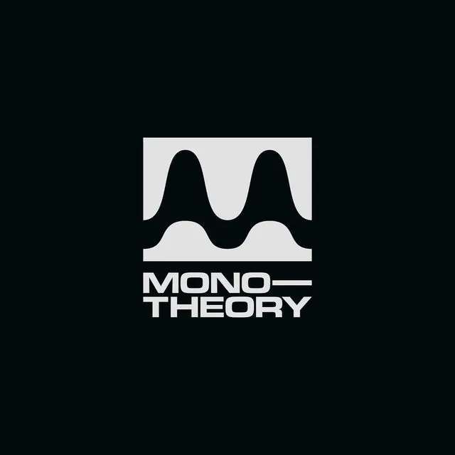
A monochrome music-tech identity where a black audio waveform inside a light square reveals a hidden M in its negative space, stacked above the wordmark MONO-THEORY.
Summary
A sophisticated audio brand mark that doubles as a monogram: a black waveform with two tall peaks and a low center dip, read as a literal sound wave or as the letter M, locked inside a light square above the stacked wordmark MONO-THEORY.
Visual description
Set on a near-black background, a light off-white square frames the primary mark: a continuous black waveform silhouette with two tall rounded peaks of unequal height and a single shorter hump between them. The white space between the black shapes reads as the letter M, making the waveform function as both an audio cue and a monogram. Below the square, the wordmark stacks vertically: "MONO" on the first line, a thin horizontal em-dash acting as a connector, and "THEORY" on the second line. Both lines sit in bold, all-caps, condensed sans-serif, tightly tracked, aligned flush-left to the square's edge. The overall lockup is clean and vertical, with no extra ornamentation.
Key takeaway
A literal waveform can serve double duty as a monogram if the peaks and valleys are shaped so that negative space reads as a letter. This dual meaning gives the mark depth without adding visual complexity. The thin horizontal rule between two stacked words, rather than punctuation or decoration, creates visual cohesion without feeling arbitrary. The monochrome palette and geometric precision make the mark work equally well at icon size or blown up as a hero lockup.
Reuse notes
Ideal for audio, music-production, podcast, or sound-design brands where a waveform reads as on-brand and the hidden M provides a memorable second read. The condensed, all-caps treatment keeps it serious and studio-grade. At very small sizes the M may dissolve, so maintain the wordmark as the primary legibility fallback. The system works on both light and dark backgrounds, though the contrast version shown here is most refined.