Preview image. Unlock full-res
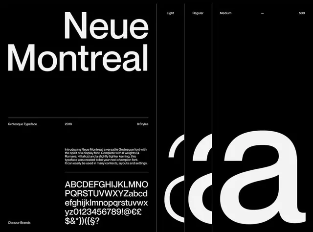
A black-ground type specimen for Neue Montreal, anchoring the name in giant white grotesque caps beside weight labels, a description block, and a full character set.
Summary
A foundry-style specimen for the grotesque typeface Neue Montreal, set in white on pure black. The two-line name in oversized caps and a giant cropped lowercase "a" carry the whole layout.
Visual description
The left two-thirds stacks "Neue" over "Montreal" in massive white grotesque caps, then drops a thin rule under which a metadata row reads "Grotesque Typeface / 2018 / 8 Styles." Below sits a short paragraph of intro copy and a full character-set block running the alphabet, numerals, and punctuation across several lines. A small "Obrazur Brands" credit anchors the bottom left. The right third is partitioned into narrow vertical columns labeled "Light / Regular / Medium / 530," and a hugely scaled lowercase "a" with an accent bleeds off the bottom-right edge, cropped so only its curve and bowl show. Everything is left-aligned on a strict grid with generous black negative space.
Key takeaway
Letting one cropped glyph at extreme scale bleed off the canvas as the hero image, so the specimen advertises the typeface's curves without any decoration. And the tidy metadata row (name / year / styles) under a hairline rule as an instant credibility signal.
Reuse notes
A reliable template for any type-specimen, foundry page, or typography-led portfolio slide. White-on-black maximizes letterform contrast but demands a clean grotesque to carry it. Swap the giant "a" for any characteristic glyph of the face being shown.
More like this






Keep what you find
A free account saves references to boards and can send you a weekly email of picks based on what you save.
To see every result, go Pro.