Preview image. Unlock full-res
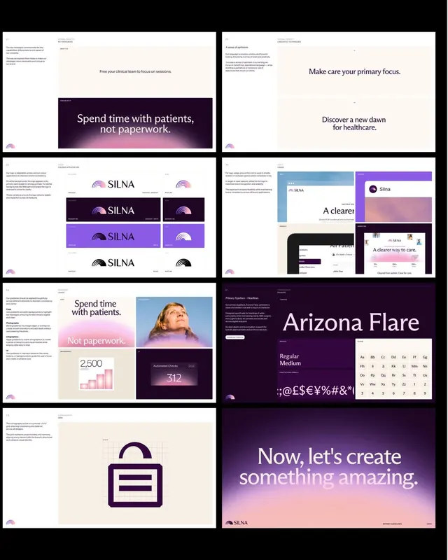
A multi-page brand guidelines spread for a healthcare-related identity system with purple gradients, serif headlines, and logo application examples.
Summary
A multi-page brand guidelines spread for a healthcare-related identity system with purple gradients, serif headlines, and logo application examples.
Visual description
The image shows a collage of several brand guideline pages arranged in a grid on a black background. Most pages use off-white panels, deep purple blocks, soft pink gradients, and a mix of serif and sans-serif typography, with examples of headlines, logo variations, iconography, and interface mockups. One page features a large serif type specimen reading "Arizona Flare," while another ends with a full-bleed purple gradient cover that says "Now, let's create something amazing."
Key takeaway
Use a restrained editorial grid with generous whitespace, then punctuate it with a single high-contrast gradient panel for emphasis. Pair a refined serif display face with small uppercase sans-serif labels to make the system feel polished and structured.
Reuse notes
This approach works well for premium identity decks, brand books, and concept presentations where the goal is to make a system feel complete and elevated. It is especially effective when you want healthcare, wellness, or service branding to feel warmer and less clinical without losing credibility.
More like this




Keep what you find
A free account saves references to boards and can send you a weekly email of picks based on what you save.
To see every result, go Pro.