Preview image. Unlock full-res
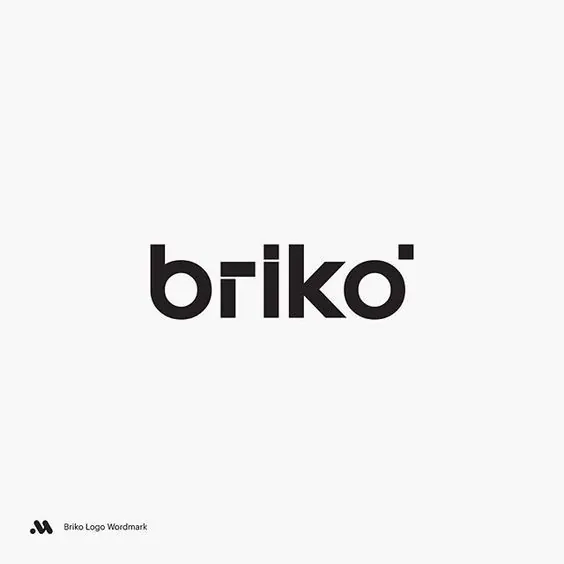
A black lowercase 'briko' wordmark in a rounded geometric sans, where the 'k' is built from a straight stem plus a detached arrow and the 'o' is nicked open at top-right by a small dot.
Summary
A heavy black lowercase "briko" wordmark in a rounded geometric sans, centered on a near-white square. Its character comes from two custom cuts: the "k" splits into a vertical stem and a separated arrowhead, and the "o" has a small detached dot biting into its top-right counter.
Visual description
The word sits dead center, large, in a single solid black weight on a soft off-white ground, with a small monogram-plus-caption credit in the lower-left corner. Letterforms are uniform-stroke geometric: circular "b" and "o" bowls, a clean "r", and an "i" whose dot reads as part of the rhythm. The "k" is the signature, its diagonal arm pulled away from the stem into a freestanding arrow-like wedge, while a tiny circular notch sits at the open top-right of the "o", breaking the closed counter. Generous margins keep the mark floating in space.
Key takeaway
Hiding two small custom modifications in an otherwise systematic geometric face: a detached arrow inside the "k" and an open-nicked "o". The base typeface stays clean and corporate, but those two cuts give it ownable personality and a subtle motion/precision cue without any added graphic mark.
Reuse notes
A strong model for a tech, hardware, or product wordmark that wants to feel engineered yet approachable. The lesson is restraint: alter one or two letters, not all of them, so the mark still reads instantly. Works best large and isolated; the custom details get lost at small sizes.