Preview image. Unlock full-res
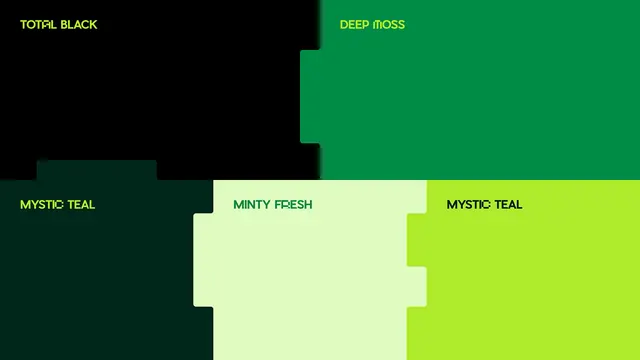
Brand color-palette board in five greens, from total black to lime, where the swatches interlock with stepped puzzle-cut edges instead of plain rectangles.
Summary
A brand color-palette layout presenting five named greens, where the swatch blocks lock into each other with notched, puzzle-piece edges rather than sitting as a flat grid.
Visual description
The frame is divided into solid color fields: a top row of black ("TOTAL BLACK") and emerald ("DEEP MOSS"), and a bottom row of near-black teal ("MYSTIC TEAL"), pale mint ("MINTY FRESH"), and acid lime ("MYSTIC TEAL"). Each block's boundary is not a straight line; the edges step inward and outward in small rounded rectangular notches so neighboring colors interlock like jigsaw tabs. Color names are set in a small all-caps condensed sans-serif tucked into the top-left of each block, each label tinted in a contrasting palette color rather than plain white. There is no imagery, only the named swatches and their carved edges.
Key takeaway
Replacing the usual rectangular swatch grid with interlocking, notched block edges, which makes a static palette feel engineered and proprietary. Tinting each color label in a sibling palette color (instead of default black or white) demonstrates the system's contrast pairs at a glance.
Reuse notes
A reference for brand-guideline color pages, style-guide slides, or a "color theory" section where you want the palette itself to feel designed. The puzzle-edge motif can carry over into dividers and section breaks elsewhere in the identity. Note the two distinct greens both labeled "MYSTIC TEAL", a naming inconsistency in the source.
More like this




Keep what you find
A free account saves references to boards and can send you a weekly email of picks based on what you save.
To see every result, go Pro.