Preview image. Unlock full-res
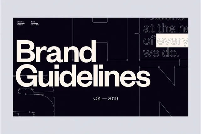
A near-black brand guidelines cover with a giant cream 'Brand Guidelines' headline laid over faint bezier-curve line art and pen-tool anchor points.
Summary
A brand guidelines title slide on a near-black ground, dominated by an oversized two-line cream "Brand Guidelines" headline. Faint vector pen-tool paths with visible anchor points snake across the dark field as background texture.
Visual description
The dark panel is framed by a pale gray margin. Thin light-gray bezier curves and square anchor nodes, the kind seen mid-edit in a vector tool, trace loosely across the background, suggesting letterform construction. Top left carries a small three-line credit block in a tidy sans-serif. The headline "Brand / Guidelines" is set in a heavy cream neo-grotesque, tracking edge to edge, with "v.01 - 2019" centered beneath in small caps. On the right, a faded ghost statement ("Excellence at the heart of everything we do.") sits in outline gray, with the word "every" reversed inside a single cream highlight box for one beat of contrast.
Key takeaway
Using actual pen-tool paths and anchor points as a decorative background ties the cover directly to the craft of building the identity. The one highlight box around a single word in an otherwise ghosted statement is a cheap, precise way to draw the eye without adding color.
Reuse notes
A strong opener for any brand book, design system doc, or studio deck where you want a technical, process-aware tone. Works best when the line-art stays faint enough to never fight the headline. The cream-on-black, single-highlight approach scales down well to a title card or section divider.
More like this






Keep what you find
A free account saves references to boards and can send you a weekly email of picks based on what you save.
To see every result, go Pro.