Preview image. Unlock full-res
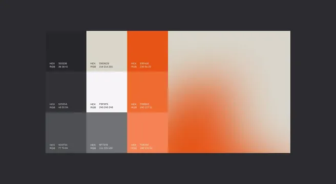
A brand color specification sheet pairing a 3x3 grid of labeled charcoal, off-white and orange swatches with a large soft orange-to-cream gradient block on a dark ground.
Summary
A brand color guideline page laying out nine labeled solid swatches in a 3x3 grid beside one large blurred orange-to-cream gradient, every swatch annotated with its HEX and RGB values.
Visual description
On a deep charcoal background, a wide panel holds three columns of color. The first two columns step through neutrals (near-black charcoals, a mid grey, an off-white, and pure F5F5F5 white); the third column runs three tints of brand orange from E65416 down to a lighter F68352. Each cell carries small white "HEX" and "RGB" labels in a clean monospace, left-aligned at the cell's base. The right half is a single oversized soft-focus gradient blending the same orange into the off-white cream, giving the precise grid an atmospheric counterpart.
Key takeaway
Placing the exact, annotated swatch grid directly next to a large diffuse gradient of the same hues shows a palette both as hard specification and as mood in one frame. The monospace HEX/RGB labels make the page double as documentation a developer can read straight off the image.
Reuse notes
A clean template for a brand-guideline or design-system color page, or a portfolio slide proving a palette. The charcoal-plus-single-orange scheme suits energetic tech, SaaS, or sports products. Keep labels in monospace and bottom-aligned so swatches of different colors stay visually consistent.
More like this









Keep what you find
A free account saves references to boards and can send you a weekly email of picks based on what you save.
To see every result, go Pro.