Preview image. Unlock full-res
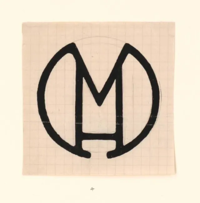
A vintage M monogram brushed in thick black ink, where the letter's outer strokes double as the enclosing circle, sketched on gridded paper.
Summary
A black-ink M monogram whose two outer legs sweep up and around to form the circle that contains it, hand-painted on faintly gridded cream paper. One continuous-looking mark does the work of both letter and frame.
Visual description
The mark sits dead-center on a square of aged, off-white graph paper with light pencil grid lines and a faint pencil guide circle still visible behind the ink. The M is built from a thick, even brush stroke: its outer two strokes curve outward and meet at the bottom to close into a near-full circle, while the inner V of the M drops to a flat foot near the base. The ink is solid but shows slight hand-brushed irregularity at the edges. A small pencil "4" is written below the mark, reading as a numbered design study. The palette is limited to black ink on warm paper, no second color.
Key takeaway
The economy of letting the letterform's own strokes become the containing shape, so the circle is not a separate ring drawn around the M but a continuation of it. Keeping the brush weight uniform across letter and frame is what fuses the two into one mark.
Reuse notes
Good reference for a heritage or craft brand that wants a circular badge monogram with a human, hand-drawn quality rather than a geometric vector. The graph-paper context also makes it a strong "process / logo study" visual. Works best in a single ink color where the stroke weight can stay consistent.