Preview image. Unlock full-res
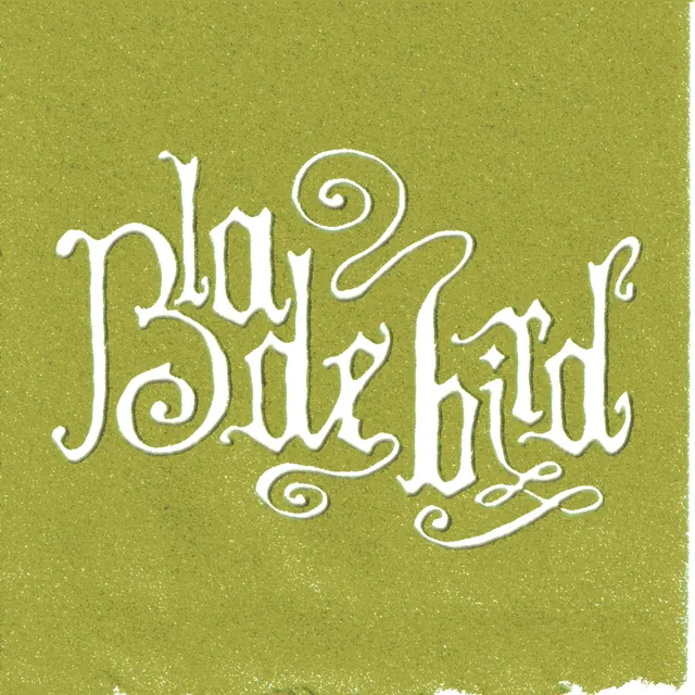
A flourished, hand-drawn script wordmark drawn in white outline on a grainy olive ground, its swashed letters interlocking across two lines into a tight ornamental lockup.
Summary
A custom hand-lettered script logotype rendered as a thin white outline over a textured olive-yellow background, with swashes and curls weaving the letters together into a single two-line ornamental block.
Visual description
The lettering is drawn, not typeset: each character carries calligraphic terminals, spiral flourishes and looping descenders that extend past the baseline and tuck under neighboring letters. The wordmark stacks onto two lines and fills a roughly square frame, centered. Color is reduced to a single white stroke; the letters are open outlines rather than solid fills, so the olive ground shows through. The background has a fine speckled grain, and the bottom-right corner shows a torn, deckled paper edge, reinforcing a handmade, aged feel.
Key takeaway
Treat the wordmark as outlined strokes instead of solid letters so the textured background reads through the type and ties mark to surface. Use shared swashes and curls as connective tissue between letters, letting one character's tail become another's flourish to bind a multi-word name into one shape.
Reuse notes
Reach for this when a brand wants a crafted, vintage, artisanal voice: small-batch food and drink, music acts, boutique studios. The interlocking script works best as a fixed lockup, not for setting body or running text, and depends on the paper grain and torn edge to avoid looking clip-art. Needs a warm, muted ground to glow.
More like this

Keep what you find
A free account saves references to boards and can send you a weekly email of picks based on what you save.
To see every result, go Pro.