Preview image. Unlock full-res
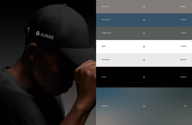
Split brand layout pairing a moody photo of a man in an AURAS black cap with a labeled, full-bleed color palette naming each swatch and its hex value.
Summary
A brand color-system board split down the middle: a dimly lit photo of a man wearing an AURAS-branded black cap on the left, and a stacked palette of seven named swatches on the right, each tagged with its name and hex code.
Visual description
The left half is a low-key product photo showing a man in profile pulling down the brim of a black baseball cap embossed with a small clover monogram and the AURAS wordmark in light gray. Skin and fabric are lit from one side against a black-to-steel gradient backdrop. The right half is a full-height stack of horizontal color bars with no gaps, running from top to bottom: Friar Grey, Police Blue, Carbon Steel, white, Pale Silver, black, and a blue-grey Gradient labeled MIX at the base. Each bar shows the color name in all-caps at left, a small three-pointed star glyph centered, and the hex value right-aligned, all in matching small sans-serif. Light text sits on dark bars and dark text on light bars for legibility.
Key takeaway
The naming convention: every swatch gets a real name (Carbon Steel, Police Blue, Pale Silver) plus its hex, which turns a flat palette into a branded vocabulary. Also the device of validating the palette against a real product photo in the same frame, so colors are shown in actual use, not in the abstract.
Reuse notes
A strong template for a brand-guideline color page or a moodboard slide where you want the palette to feel owned rather than generic. The paired-photo half makes it suitable for apparel, fashion, and consumer brands. Works best on dark; the named-swatch list pattern transfers to any vertical.
More like this
Keep what you find
A free account saves references to boards and can send you a weekly email of picks based on what you save.
To see every result, go Pro.