Preview image. Unlock full-res
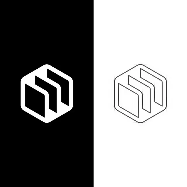
A geometric hexagonal logo is shown twice in a split black-and-white presentation, once filled in white on black and once outlined in gray on white.
Summary
A geometric hexagonal logo is shown twice in a split black-and-white presentation, once filled in white on black and once outlined in gray on white.
Visual description
The image is divided vertically into two equal halves, with a black field on the left and a white field on the right. Each side contains the same hexagonal geometric logo, rendered as a solid white mark on the left and as a thin gray outline on the right.
Key takeaway
The strong split-screen comparison makes the logo feel like a study in positive and negative space. The simple hexagonal geometry and thick ribbon-like strokes create a memorable, scalable mark.
Reuse notes
Use this approach when presenting a logo concept in both filled and outlined variants. It works well for identity systems that need to feel precise, minimal, and adaptable across dark and light backgrounds.