Preview image. Unlock full-res
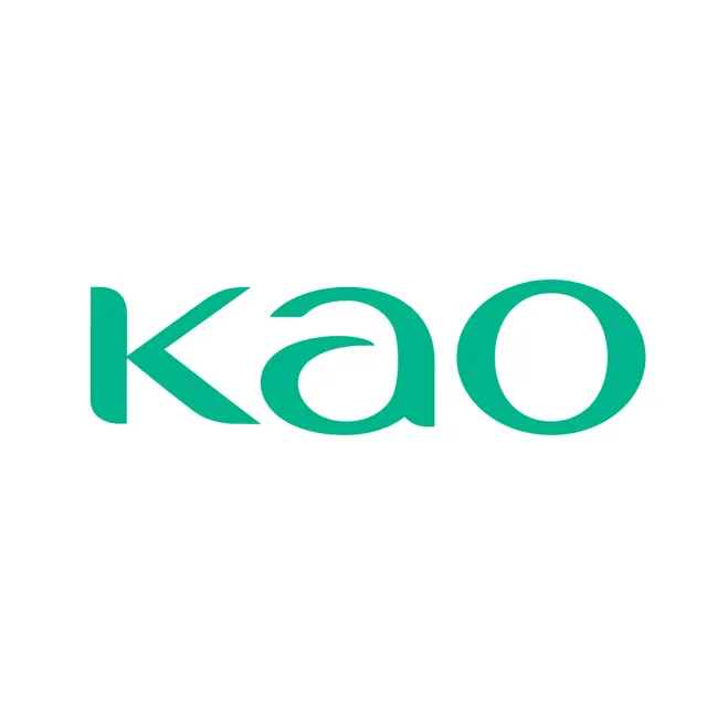
A lowercase three-letter wordmark set in solid teal on white, built from a soft rounded sans-serif with a distinctive single-story 'a' and a knife-cut terminal on the 'k'.
Summary
A solid-teal lowercase wordmark on a plain white field, defined by its custom letterforms: a slanted knife-cut on the 'k', a closed single-story 'a', and a perfectly circular 'o'.
Visual description
Three lowercase letters sit centered on white, filled in a single flat teal with no outline, gradient, or shadow. The forms are heavy and rounded with generous counters. The 'k' is unusual: its diagonal strokes meet at a sharp angled cut rather than a standard junction, reading almost like an arrow. The 'a' is a closed, geometric single-story shape, and the 'o' is a near-true circle, giving the trio a soft, even rhythm. Letter spacing is tight so the word reads as one compact mass.
Key takeaway
The custom 'k' with its angular knife-cut terminal does the identity work: one engineered letter against two simple geometric forms is enough to make a generic lowercase word feel proprietary. Filling the mark in one flat brand color keeps it reproducible at any size.
Reuse notes
A good template for a short, friendly brand name where you want warmth without script or serifs. Pick the single most-repeated letter to customize and leave the rest plain. The flat single-color treatment works on light backgrounds and inverts cleanly to white on teal. </content> </invoke>