Preview image. Unlock full-res
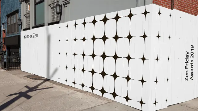
Architectural brand application using a repeating four-pointed star or plus-sign pattern across white facade panels, creating rhythm and visual texture.
Summary
Environmental branding for Yandex Zen using a repeating four-pointed star or plus-sign motif tiled across white facade panels, translating a digital media brand into physical architectural space with rhythm and restraint.
Visual description
A long horizontal white panel wall is densely tiled with a repeating geometric motif—a four-pointed star or plus sign—arranged in a regular grid. The pattern is rendered in a dark grey or black, creating high visual contrast against the white ground. The repetition creates optical rhythm and subtle movement across the facade. Text identifying "Yandex Zen" and "Zen Friday Awards 2019" appears in a clean, modern sans-serif typeface, set in black, understated against the patterned field. The fence line and adjacent architectural elements frame the installation, showing its scale and real-world application.
Key takeaway
A repeating geometric motif applied at an architectural scale to reinforce brand identity. The simplicity and regularity of the pattern makes it reproducible and scalable. The high-contrast black-on-white creates legibility from a distance while the rhythm adds visual interest. The restraint (one motif, one color, one surface) prevents the design from becoming noise.
Reuse notes
Suitable for media companies, tech brands, or any organization wanting to extend their identity into physical space. The modular pattern adapts to curved or irregular surfaces. Works as exterior signage, interior wall treatments, or large-format installations. The geometric approach feels contemporary but timeless. Avoid if the brand requires color or organic imagery.