Preview image. Unlock full-res
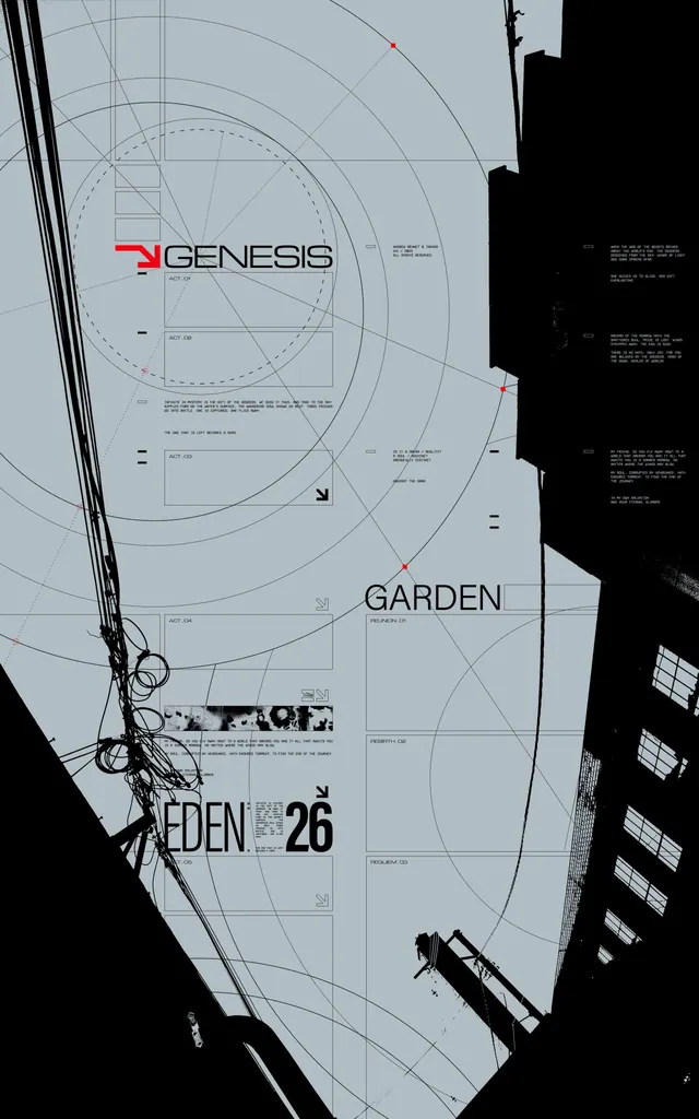
Technical diagram documenting a modular brand system with geometric construction lines, compass guides, and red accent points defining spatial relationships and logo placement rules.
Summary
A brand specification document showing technical construction rules for a modular identity system via geometric grid, compass guides, and red reference marks layered over wordmarks and type treatment.
Visual description
Light gray background overlaid with concentric circles, compass radials, and rectangular grid units defining spatial relationships. The "GENESIS" logotype appears in sans-serif with a red directional accent mark in the upper left. Overlaid black silhouettes (rectangular shapes, curved forms) occupy the right and lower edges, suggesting photo or imagery boundary zones. Additional text labels ("GARDEN", "EDEN 26") sit at intermediate positions, and small callout boxes with specification text are scattered throughout. Red dots mark critical anchor or alignment points at cardinal and diagonal positions. Thin black construction lines and dashed guides impose mathematical order on the composition.
Key takeaway
The construction-based approach to brand specification: using circles, grids, and guide points to establish repeatable spatial rules rather than static mockups. The monochromatic palette with single red accent creates high visual separation for critical information. Red anchor marks act as a scannable hierarchy layer without competing with the main mark.
Reuse notes
Excellent reference for designing modular brand systems where consistency across applications matters (SaaS, B2B, agency identities). Works best when the system genuinely needs mathematical constraint; overuse on simple logos can feel clinical. Pair with typography specs and usage guidelines for a complete brand document.