Preview image. Unlock full-res
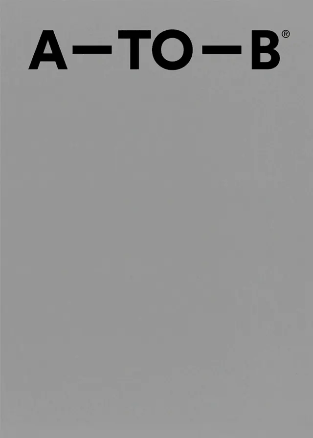
A bold, centered wordmark displaying 'A—TO—B®' in heavy black sans-serif against a neutral gray background.
Summary
A precision wordmark presenting 'A—TO—B®' in extra-heavy black sans-serif type, centered in the upper-middle portion of a uniform gray field.
Visual description
The wordmark displays 'A—TO—B®' with em-dashes connecting the letters, rendered in a thick, weighted sans-serif typeface. The composition is centered horizontally and positioned in the upper third of the frame against a medium gray background. The ® registered trademark symbol sits scaled appropriately to the right of 'B'. All elements are rendered in pure black with sharp edges and no decorative elements.
Key takeaway
Extreme letter weight and precise centering convey confidence and structural authority. The wordmark's simplicity makes it highly legible and scalable across applications.
Reuse notes
Excellent for corporate identity, tech company logos, or minimalist brand systems. The centered composition reads well at small and large scales. The color and weight restrict it to professional contexts.
More like this






Keep what you find
A free account saves references to boards and can send you a weekly email of picks based on what you save.
To see every result, go Pro.