Preview image. Unlock full-res
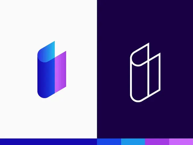
A split-screen logo presentation shows a colorful filled mark on white beside a white outline version on deep purple.
Summary
A split-screen logo presentation shows a colorful filled mark on white beside a white outline version on deep purple.
Visual description
The image is divided vertically into two halves. On the left, a filled abstract logo with blue-to-purple gradients sits on a white field, and on the right, the same form is reduced to a white outline on a deep purple background. A thin color strip runs along the bottom edge with several saturated blue and purple swatches.
Key takeaway
Use a single geometric logo shown in two treatments: filled gradient and outline-only. The split light/dark presentation makes the mark feel flexible and polished.
Reuse notes
This works well for identity case studies, logo presentations, and brand boards where you want to show versatility fast. Reach for it when the core idea is a simple abstract symbol that benefits from both color and monochrome versions.