Preview image. Unlock full-res
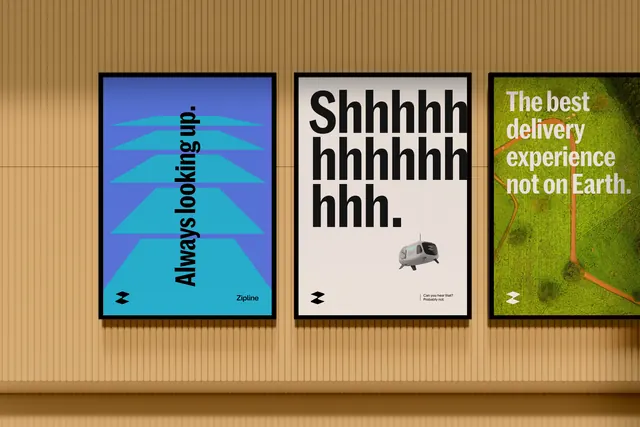
Three framed campaign posters on a wood-textured wall showcasing the Zipline delivery brand: gradient abstraction, typographic monochrome, and nature imagery, each with bold messaging.
Summary
A three-poster campaign for Zipline delivery brand: an abstract teal-to-blue gradient poster with diagonal layering, a black-and-white typographic poster with onomatopoeia "Shhhhh bhhhhhh hhh", and a green moss/nature photograph, each mounted in black frames on a ribbed wood wall.
Visual description
Three identical black-framed posters hang on a vertical-ridged wooden wall surface. The left poster features a layered gradient composition from deep blue at top through teal and cyan, with a diagonal repeated text pattern reading "Always looking up" at an angle. The center poster is stark black typography on white: oversized repeated "h" characters with accompanying icon and smaller text. The right poster is a rich photograph of moss or lichen texture in lime green, with white sans-serif headline "The best delivery experience not on Earth." All three maintain consistent framing and spacing, presenting a cohesive brand campaign.
Key takeaway
The triptych format creates narrative through contrast: abstract pattern, bold typography, and natural photography each convey a different brand message while maintaining visual unity through framing. The color palette (teal, black, green) ties the three distinct treatments into a single brand story. The playful tagline paired with nature imagery reframes delivery service as eco-conscious and adventurous.
Reuse notes
Excellent reference for multi-poster campaign work, especially logistics or adventure-focused brands. The three-part structure (abstract, type-led, photography) is a proven formula for in-space installations. Works best when the posters are framed and displayed together; individual posters are less distinctive. The wood-wall mounting emphasizes the campaign's physical presence.