Preview image. Unlock full-res
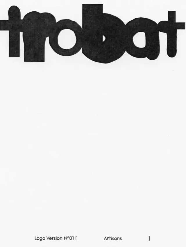
A black sans-serif wordmark on white, using continuous heavy strokes to form organic, bulbous letterforms with cutout counter-shapes.
Summary
A black sans-serif wordmark on white, using continuous heavy strokes to form organic, bulbous letterforms with cutout counter-shapes.
Visual description
The word "Tmoodat" is rendered in a single weight, solid black sans-serif with notably rounded, almost sculptural character forms. Each letter is built from thick strokes that curve generously, and the counter-spaces (the holes within letters like the 'o', 'd', and 'a') are substantial, creating visual rhythm through the negative space. The letterforms are monolithic and appear hand-drawn or custom-modified rather than drawn from a standard typeface. A small specimen label "Logo Version No01" appears below in lighter gray type. The white background provides stark contrast.
Key takeaway
The custom modification of heavy sans-serif forms to have personality through curved, organic bulges and prominent counter-spaces. The boldness of the weight combined with the simplicity of monochrome makes it read clearly at any scale while remaining memorable.
Reuse notes
Suitable for branding where a single, distinctive mark is needed. The heavy weight and organic quality suit forward-thinking, confident brands in tech, product design, or creative services. The monochrome approach ensures reliable reproduction across media. Scale well to large formats (signage) and down to small sizes (favicon).