Preview image. Unlock full-res
Minimalist investment brand identity using a geometric symbol system, teal-to-lime color palette, and structured sans-serif typography for founder-focused positioning.
Summary
Minimalist investment brand identity using a geometric symbol system, teal-to-lime color palette, and structured sans-serif typography for founder-focused positioning.
Visual description
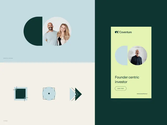
The composite shows a brand identity for "Coventure" with multiple elements. On the left: a light blue-gray background holds a dark teal semi-circle overlapping a portrait photo of two professionals. A small label reads "PHOTO USAGE". Below are three geometric symbols: a filled teal square with corner marks, a light blue circle with a center dot, and a forward-pointing chevron shape with angular lines. On the right: a bright lime-green card presents the "Coventure" wordmark in a compact sans-serif, a circular photo of a man, the tagline "Founder centric investor", and a "Learn more" button, all on the lime background against a dark teal border. Small text notes the website at bottom right.
Key takeaway
The geometric symbol system provides flexible, versatile marks (circles, squares, chevrons) that can scale and combine. The teal-lime contrast is bold but controlled. The system clearly separates photo-usage guidance from logomark from marketing application, signaling a well-documented identity.
Reuse notes
Ideal for fintech and investment platforms aiming to feel modern and data-driven yet approachable. The geometric elements are strong at small sizes (icons, UI). The lime accent pops on teal, making it useful for CTAs and emphasis without overwhelming the palette.