Preview image. Unlock full-res
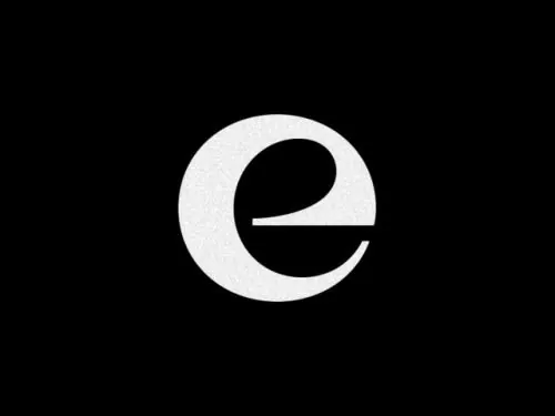
Geometric lowercase 'e' mark formed by a white shape cutting through a black circle, high-contrast monochrome.
Summary
Lowercase 'e' as a monogram, constructed by cutting a clean letterform through a white circle centered on black.
Visual description
A white circular form sits centered in a black square. Within the circle, a geometric sans-serif lowercase 'e' shape cuts through, creating a carved or die-cut effect. The white and the negative black space together read as the letter. The geometry is restrained and precise, with no texture or gradation. The contrast is absolute: pure black, pure white, sharp edges throughout.
Key takeaway
The clever use of negative space where the letter itself is built from the absence of color rather than its presence. Works as a container/frame as well as a mark, making it flexible for application to different backgrounds. The monochromatic palette ensures it reads equally well at icon scale or large display.
Reuse notes
Strong for tech, software, or design-forward brands where geometric abstraction signals precision. The cutout effect works well on packaging, app icons, or woven into patterns. Test at small sizes to ensure the letterform remains readable without simplifying too much.