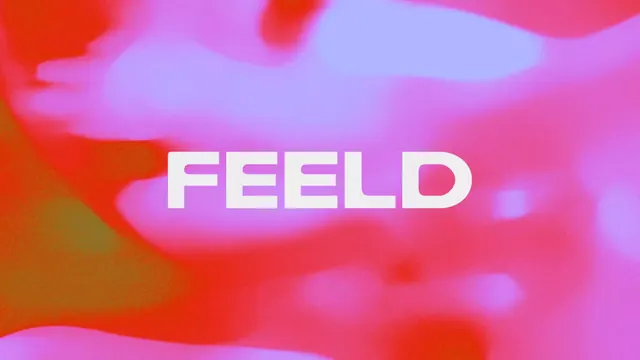
Preview image. Unlock full-res
The word 'FEELD' in bold white all-caps sans-serif overlaid on a fluid, warm-to-cool gradient background with soft blurred organic shapes.
Summary
A modern wordmark featuring chunky white lettering centered over a rich, blurred gradient landscape transitioning from warm coral-orange to cool lavender and periwinkle.
Visual description
The composition is dominated by a soft, amorphous gradient field flowing from orange-red (lower left) through hot pink and magenta to lavender and pale blue (upper right and center). The gradient is deliberately blurred and organic, with wave-like forms suggesting movement. Centered horizontally, the word "FEELD" sits in bold, geometric, white sans-serif capitals with generously rounded letterforms and even spacing. The text remains sharp and legible, anchoring the composition and contrasting sharply against the warm-cool color transition behind it.
Key takeaway
The gradient backdrop technique: blurred, directional color transitions create visual depth and energy without demanding attention away from the text. The white-on-gradient contrast model is robust and works at scale. The slightly rounded geometric sans-serif feels contemporary and pairs well with music/tech brands.
Reuse notes
Excellent for music, audio, streaming, or forward-thinking tech brands. The warm-to-cool gradient reads as dynamic and immersive. Works best at display sizes (hero sections, headers, hero video backgrounds) where the gradient can breathe. On small scales, the gradient simplifies too much; use a solid color fallback for favicon/app-icon contexts.
More like this







Keep what you find
A free account saves references to boards and can send you a weekly email of picks based on what you save.
To see every result, go Pro.