Preview image. Unlock full-res
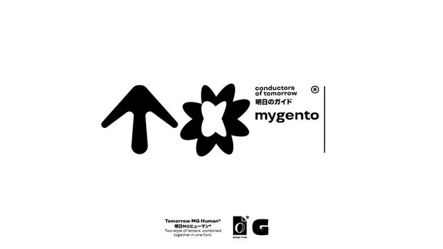
Bilingual brand identity for Mygento (a technology guide) combining an abstract two-part symbol with clean sans-serif type and Japanese characters, unified by a vertical rule.
Summary
Mygento brand identity pairing two abstract geometric symbols (an upward arrow form and a star-like shape) with clean lowercase sans-serif wordmark and bilingual English-Japanese tagline.
Visual description
Two solid black geometric forms sit left of center: an upward-pointing arrow with rounded, organic edges, and a five-petal flower or star shape with a white cutout heart at its core. To the right, the wordmark "mygento" is set in a modern sans-serif at a smaller scale, flanked by English tagline "conductors of tomorrow", Japanese characters "明日のガイド", and a registered trademark symbol. A thin vertical rule divides the mark from the type. The entire composition is balanced on a white background with even spacing throughout.
Key takeaway
The modular symbol system: two independent marks that can stack vertically or sit side-by-side, lending flexibility to lockup arrangements. The use of negative space in the flower shape (the white heart) adds sophistication to an otherwise solid mark. The bilingual tagline structure (English over Japanese) below the wordmark is a clean way to signal international scope.
Reuse notes
Strong for tech-forward or consulting brands targeting multilingual audiences. Works well at small scale due to the clarity of the geometric forms. The registered trademark placement and rule add formality, suitable for mature, established institutions. Bilingual treatment shows intent without cluttering the mark.