Preview image. Unlock full-res
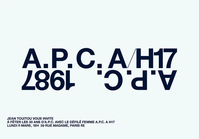
A minimalist graphic design featuring a mirrored and rotated typographic arrangement of the brand names A.P.C. and Jean Paul Gaultier.
Summary
A minimalist graphic design featuring a mirrored and rotated typographic arrangement of the brand names A.P.C. and Jean Paul Gaultier.
Visual description
The design features large, bold sans-serif letters arranged in a symmetrical, mirrored layout against a light gray background. The text 'A.P.C. A/H17' and '1986' are rotated and flipped to create a balanced, architectural composition.
Key takeaway
The design uses geometric symmetry and high-contrast typography to create a sophisticated, avant-garde brand identity.
Reuse notes
This layout can be adapted for high-fashion editorial spreads, streetwear branding, or minimalist packaging.
More like this
Keep what you find
A free account saves references to boards and can send you a weekly email of picks based on what you save.
To see every result, go Pro.