Preview image. Unlock full-res
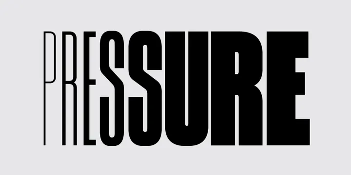
The word PRESSURE rendered in a bold sans-serif with consistent horizontal striping and thin vertical outlines throughout, creating a textured monochrome effect.
Summary
The word PRESSURE set in an oversized sans-serif font where every letterform is treated consistently with thin vertical outline strokes creating a striped, linear texture across the entire word.
Visual description
Large uppercase letters P-R-E-S-S-U-R-E displayed center-aligned on a light gray background. Each letter is rendered with thin black vertical lines evenly spaced within the letterforms, creating a consistent striped or hatched texture. The outline stroke is thin and precise, maintaining uniform weight throughout. The interior striping gives the letters a sense of motion and dimensionality while remaining entirely flat and monochromatic.
Key takeaway
Applying a consistent textural pattern (striping) to every letter unifies the wordmark while creating visual interest and movement. The technique transforms a simple sans-serif into something more conceptual and memorable. The restraint of black and white with one geometric pattern creates sophistication.
Reuse notes
Ideal for experimental branding, music/entertainment industries, or editorial design. The striped technique can be applied to any typeface to create visual distinction. Works best at large scale where the interior detail reads clearly. May challenge legibility at very small sizes.