Preview image. Unlock full-res
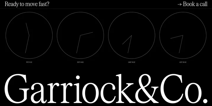
A dark-mode layout featuring four minimalist clock faces with different hand positions and a bold wordmark.
Summary
A dark-mode layout featuring four minimalist clock faces with different hand positions and a bold wordmark.
Visual description
Four circular clock faces with thin white lines are arranged horizontally against a black background. Below them, a large white wordmark reads 'Garriock&Co.' with small instructional text above the clocks.
Key takeaway
The design uses high-contrast monochrome and geometric simplicity to convey a sense of precision and timing.
Reuse notes
Use the high-contrast monochrome palette and minimalist line-art for time-related branding.
More like this






Keep what you find
A free account saves references to boards and can send you a weekly email of picks based on what you save.
To see every result, go Pro.