Preview image. Unlock full-res
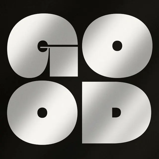
A chrome/metallic gradient wordmark spelling GOOD, built from circular and rectangular geometric letterforms arranged in a 2x2 grid on black.

Summary
A chrome/metallic wordmark spelling "GOOD" in a 2x2 grid, each letter built from rounded and squared geometric forms rendered in a bright white-to-silver gradient against pure black.
Visual description
Four letterforms fill a square grid: G (top-left) is a rounded shape with a straight crossbar and a small square notch cut from its lower-right; O (top-right) is a full circle with a small black dot punched near its center; O (bottom-left) is another full circle with the same small black center dot; D (bottom-right) is a squared-off rounded form with a small black arc cut into its right edge. Every letter shares the same diagonal silver-to-white gradient, giving the flat shapes a polished, chrome-like sheen. The letters butt up against each other with almost no gap, reading as a single unified 2x2 block rather than a horizontal wordmark. The black background makes the metallic gradient read as glowing light on brushed metal.
Key takeaway
Turning a short wordmark into a tight geometric grid, with every letter reduced to circles, rounded rectangles and a shared crossbar, makes the word read instantly as both type and abstract pattern. The uniform chrome gradient across all four letters unifies otherwise very different letterforms into one cohesive mark.
Reuse notes
Good reference for a compact, symbol-like logotype for a brand with a short name, especially where a single square lockup (app icon, favicon, stamp) is needed alongside a wordmark. The metallic gradient treatment reads premium and works best on dark backgrounds; would lose contrast on light ones.