Preview image. Unlock full-res
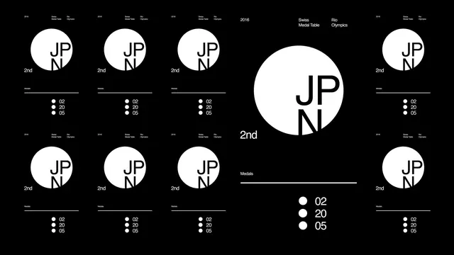
A comprehensive visual identity system showcasing various logo lockups, wordmarks, and layout variations for 'JP N'.
Summary
A comprehensive visual identity system showcasing various logo lockups, wordmarks, and layout variations for 'JP N'.
Visual description
A black and white grid layout featuring multiple circular and linear logo iterations. The design uses a strict modular system with varying weights of 'JP N' characters and accompanying small-scale text.
Key takeaway
Demonstrates how a single brand mark can be adapted into diverse functional lockups while maintaining visual consistency.
Reuse notes
Use as a reference for creating a modular brand guidelines sheet or a systematic logo exploration.
More like this
Keep what you find
A free account saves references to boards and can send you a weekly email of picks based on what you save.
To see every result, go Pro.