Preview image. Unlock full-res
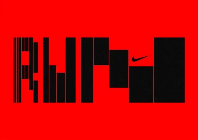
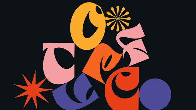
A high-contrast, experimental typographic treatment of the Nike brand name using distorted, blocky letterforms.
Summary
A high-contrast, experimental typographic treatment of the Nike brand name using distorted, blocky letterforms.
Visual description
The word 'NIKE' is rendered in a heavy, black, blocky typeface against a solid bright red background. The letters are fragmented into vertical bars and geometric shapes, with the iconic swoosh logo integrated into the final 'E'.
Key takeaway
Uses extreme distortion and high-contrast colors to create a high-impact, aggressive brand statement.
Reuse notes
Apply to bold social media headers or large-scale physical out-of-home advertising.
More like this
Keep what you find
A free account saves references to boards and can send you a weekly email of picks based on what you save.
To see every result, go Pro.