Preview image. Unlock full-res
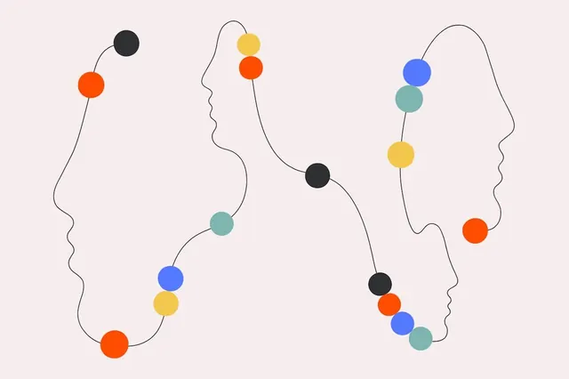
Two open-ended line-drawn silhouettes facing left and right, connected by colored dots stacked vertically along curved paths, suggesting dialogue and flow on pastel pink ground.
Summary
Two profile outlines facing inward are connected by stacked, colored dots suspended along organic curved lines, evoking psychological connection and mutual growth on a pale pink background.
Visual description
Two minimalist head silhouettes in black outline form the left and right edges of the composition, both with undulating contours that convey movement and expressiveness. Between them run sinuous vertical pathways in black line, each hosting a vertical stack of 3-5 colored dots arranged in varied orders: orange-red, cobalt-blue, mustard-yellow, and teal-green circles sized 40-80px, clustered at different heights and points along the curving lines. The dots create a visual rhythm of exchange and flow between the two profiles, suggesting dialogue, thought exchange, or personal connection. Light warm-pink background provides soft contrast to the geometric color story (no pastels per se, but warm-leaning and energy-balanced). The overall composition balances organic (wavy lines, living color) with geometric (perfect circles, symmetrical arrangement).
Key takeaway
The stacked-dot chain is a flexible metaphor: can represent connection, energy transfer, thoughts, emotions, or stages in a process without being literal. The use of primary + secondary hues (blue, orange, yellow, teal) in pure, medium saturation reads as friendly and energetic while remaining professional. The open profiles let viewers project their own identity; the restraint in line weight and negative space prevents visual noise even with colored elements.
Reuse notes
Excellent for healthcare, counseling, education, and organizational psychology platforms or campaigns. Works well at 400x600px+ for web or print (good icon-to-display scaling). Pairs well with clean sans-serif type and whitespace. The warm-pink ground is distinctive but replaceable; can work on white for a crisper look, or deeper tones for premium feel. Avoid cropping or flipping; the implied left-right dialogue is essential.
More like this

Keep what you find
A free account saves references to boards and can send you a weekly email of picks based on what you save.
To see every result, go Pro.