Preview image. Unlock full-res
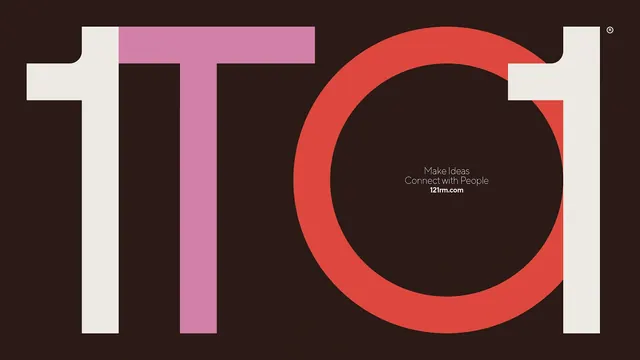
A bold, stylized typographic treatment of the letters 'TOO' using thick strokes and contrasting colors.
Typesans-serif, oversized, all-caps
Palette
#2B1B14
#EDECE4
#D47DA5
#DB433B
Summary
A bold, stylized typographic treatment of the letters 'TOO' using thick strokes and contrasting colors.
Visual description
The design features the letters 'T', 'O', and 'O' in heavy block weights. The 'T' is split into two colors, the first 'O' is a large red circle, and the final 'O' is a white outline with a small white rectangle detail.
Key takeaway
The design uses high-contrast colors and heavy geometric shapes to create a memorable, impactful visual identity.
Reuse notes
Can be used as a primary logo or a bold header element for branding materials.