Preview image. Unlock full-res
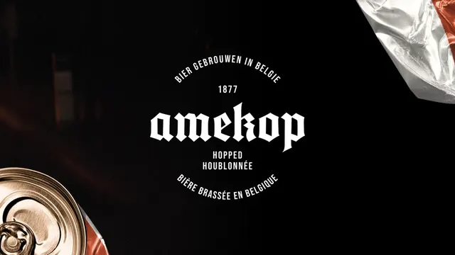
Bold gothic wordmark for a Belgian beer brewery established in 1877, featuring hopped ale branding with multilingual text.
Summary
Bold gothic wordmark for a Belgian beer brewery established in 1877, featuring hopped ale branding with multilingual text.
Visual description
A white logo on a black background featuring the word amekop in a bold, blackletter typeface. The brand name is flanked by the year 1877 above and the words HOPPED HOUBLONNÉE below. Arched text in a sans-serif font circles the top and bottom of the central composition.
Key takeaway
Use a high-contrast blackletter font paired with a clean, minimalist sans-serif to balance traditional heritage with modern clarity.
Reuse notes
Reach for this when designing a wordmark for food & drink, saas. Pairs with classic, premium identity systems. Original by Jonas Leupe.