Preview image. Unlock full-res
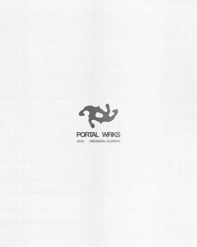
A centered, geometric abstract mark above stacked sans-serif text reading 'Portal Works', '2026', and 'Dimensional Doorways' in neutral gray, emphasizing symmetry and precision.
Summary
A centered, geometric abstract mark above stacked sans-serif text reading 'Portal Works', '2026', and 'Dimensional Doorways' in neutral gray, emphasizing symmetry and precision.
Visual description
Centered on a light gray background. Above the text sits a stylized, abstract mark consisting of angular, interlocking shapes suggesting a portal or dimensional gateway. The mark is symmetrical and composed of curved and straight edges that read as both playful and technical. Below the mark sits 'PORTAL WORKS' in all-caps, condensed sans-serif, neutral gray. Below that, '(2026)' in smaller type, and finally 'DIMENSIONAL DOORWAYS' as a descriptive tagline in even smaller, lighter gray type. The entire composition is vertically centered and stacked, with generous whitespace above and below. The monochrome palette and clean geometry create a polished, modern identity.
Key takeaway
The stacked typographic hierarchy that moves from logomark, to primary name, to year, to descriptor. Each line gets progressively smaller and lighter, creating a clear reading path. The geometric mark is complex enough to be memorable but restrained enough to hold against the type. The monochromatic palette gives the whole system a unified, professional feel.
Reuse notes
Strong reference for tech or architecture branding where precision and system thinking matter. The stacked layout works well on square or vertical formats (business cards, letterheads, favicon/mark-only usage). The 2026 date suggests this may be a personal or fictional project; reuse the structure, not the date. Pairs well with a complementary color or photographic elements for supporting collateral.