Preview image. Unlock full-res
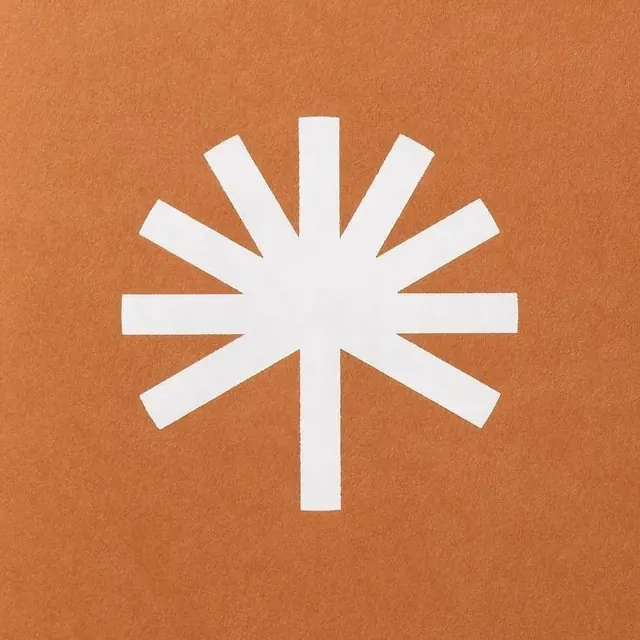
A white starburst or cross symbol radiating outward, symbolizing growth, light, and renewal for a forest conservation brand.
Colorlight, warm, monochrome, pastel
Typesans-serif
Moodcalm, professional
Industryhealthcare, nonprofit, real-estate
Tagsmemorial, sustainability, nature, afterlife, symbolic, Star, Cross, Geometric, Negative space, Bold, Serious, symbol, monochromatic, warm, orange, neutral
Palette
#C3713F
#EDEAEB
#DDC3B1
Summary
A white starburst or cross symbol radiating outward, symbolizing growth, light, and renewal for a forest conservation brand.
Visual description
A white geometric symbol consisting of eight radiating arms of varying lengths centered on a terracotta-colored background. The arms are rectangular with flat ends, forming a stylized star or sunburst shape.
Key takeaway
Use asymmetrical arm lengths in a radial burst to create a sense of organic movement within a rigid geometric structure.
Reuse notes
Reach for this when designing a logo for non-profit, health & wellness. Pairs with calm, serious identity systems. Original by &Walsh.