Preview image. Unlock full-res
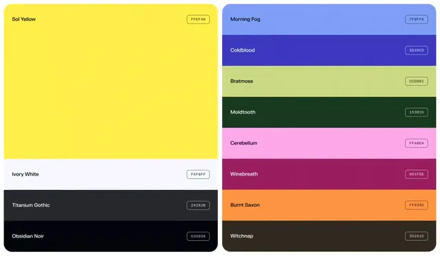
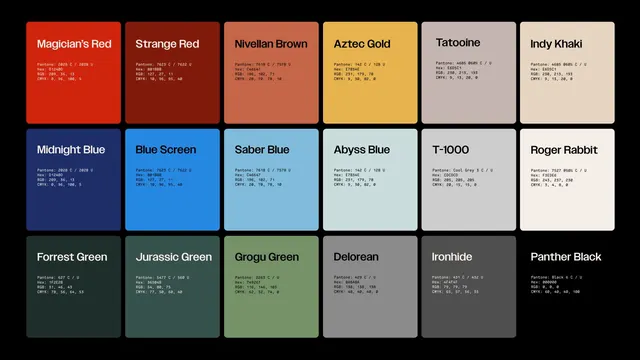
Vibrant color palette showing 14 poetic color names paired with hex codes, split between warm left panel and cool right panel with named swatches.
Summary
Vibrant color palette showing 14 poetic color names paired with hex codes, split between warm left panel and cool right panel with named swatches.
Visual description
A two-panel color system presentation. Left side features a bold sol-yellow dominating the upper half with "Sol Yellow" label and hex code FFEF46, and below it "Ivory White" and "Titanium Gothic" (near-black) labels with codes. Right side displays nine horizontal color bands each with poetic names and their hex values: Morning Fog (soft blue), Coldblood (deep purple), Bratmoss (pale green), Moldtooth (forest green), Cerebellum (hot pink), Winebreath (wine red), Burnt Saxon (orange), and Witchnap (dark brown). Sans-serif labels sit to the left of each swatch; hex codes in small uppercase type sit top-right. No imagery, pure color presentation.
Key takeaway
Poetic color naming elevates a purely functional palette into something memorable and distinctive. The split layout (one dominant color vs. a grid of smaller swatches) creates hierarchy. Pairing hex codes directly on the swatch avoids separate documentation. The organized approach scales well for design systems and brand guidelines.
Reuse notes
Use for design system documentation, theme specifications, or digital product color libraries. The naming convention works best for brands with personality (creative, media, or lifestyle). The structured layout suits both print and digital guidelines. Consider this layout when you need to present color relationships clearly while keeping the artifact compact and scannable.
More like this






Keep what you find
A free account saves references to boards and can send you a weekly email of picks based on what you save.
To see every result, go Pro.