Preview image. Unlock full-res
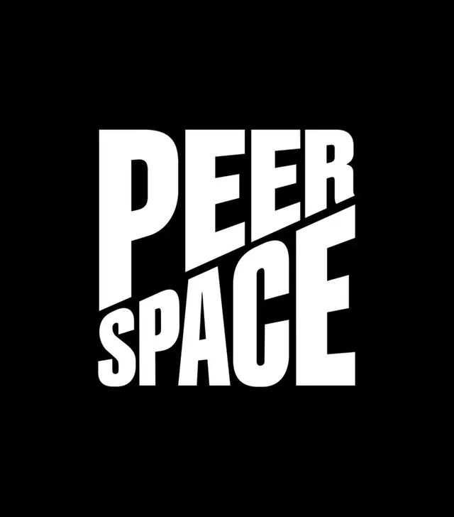
All-caps sans-serif wordmark set in two stacked lines with a diagonal cutting line bisecting the lower text, rendered in white against pure black.
Summary
A pure typographic identity using all-caps, condensed sans-serif set vertically, interrupted by a single diagonal slash cutting through the lower word, creating geometric tension on pure black and white.
Visual description
White sans-serif lettering, all caps and tightly condensed, stacks vertically into two words with substantial letter weight. The lower word is visually bisected by a sharp diagonal line running from lower-left to upper-right, creating a geometric interrupt. The composition centers on a black field, and the stark white-on-black contrast reads as severe and intentional. The type remains consistent in weight, stroke, and proportion; only the diagonal element introduces a secondary geometric gesture.
Key takeaway
The discipline of typographic-only identity without embellishment. The use of a single diagonal line to add compositional complexity while maintaining minimalism. The visual rhythm created by stacking related terms with an unexpected geometric break.
Reuse notes
Strong for tech, developer-tool, or media brands seeking directness and authority without decoration. The high contrast and geometric line-work translate effectively to small scales (favicon, social avatar) and large formats (signage, environmental). Condenses well on mobile contexts. The diagonal slash offers an entry point for animation or interactive effect without abandoning minimalism.