Preview image. Unlock full-res
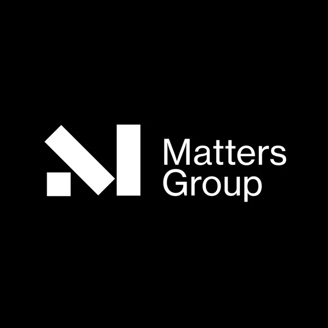
Monochrome logo using three interlocking white geometric shapes (rotated square, vertical bar, and diagonal bar) paired with modern sans-serif wordmark.
Summary
Matters Group identity: a mark composed of three interlocking geometric forms (45-degree rotated square, vertical rectangle, diagonal bar) creating an abstract shape, combined with the company name in light sans-serif.
Visual description
Three white geometric shapes arranged horizontally on black: a small rotated square (diamond orientation), a tall vertical rectangle, and a tilted rectangle at 45 degrees, all fitting into a compact spatial grid with mathematical precision. Adjacent sits "Matters Group" in a contemporary sans-serif face, weight 300 or lighter, with generous letterspacing and clean serifs on the capital letters. The mark's three pieces could suggest assembling, building, or interconnection. Negative space between the shapes is as important as the shapes themselves.
Key takeaway
Abstract mark structure suggesting a noun (blocks, matter, building) without representing it literally; the use of rotation and staggered heights creating visual dynamism within a minimal palette; the thin, generous-spaced wordmark pairing well with a geometric icon without competing for attention; the concept of using negative space as a design element at mark scale.
Reuse notes
Suited for technology, finance, or professional-services brands targeting corporate buyers. The mark's abstraction gives it longevity across markets and sectors. Works at small scale (favicon, app icon) and large (signage) without losing clarity. The monochrome palette demands good contrast and doesn't work well on mid-gray or image backgrounds without a keyline or badge container.