Preview image. Unlock full-res
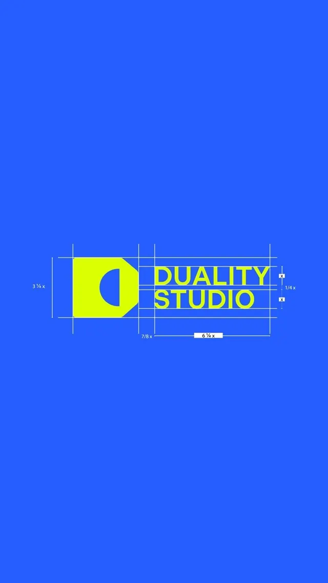
Design studio identity with crescent-shaped negative-space mark and all-caps wordmark on technical grid overlay.
Summary
Design studio logo combining a bold yellow crescent letterform with bright blue wordmark, presented with proportional grid and construction guides.
Visual description
Bright blue background (approximately #265DFE) filling most of the frame. In the center: a yellow rectangular box containing a negative-space crescent mark in the bottom-right corner in bright blue, positioned left of all-caps "DUALITY STUDIO" text in the same yellow. The logo sits within a visible blue grid structure with measurement annotations (3 3/4 x, 1/4 x, 7/8 x, 6 1/4 x) showing the proportional construction system. Thin grid lines frame the entire composition, emphasizing geometric precision.
Key takeaway
The negative-space crescent functions as a reductive mark that hints at a C (for the studio name perhaps) while reading as an abstract shape. The yellow-on-blue complementary pair is bold enough to hold the dense geometry. The visible grid transforms the logo from a mark into a system, suggesting technical rigor and intentional design.
Reuse notes
Best for creative agencies and design studios where process and precision matter to the audience. The high-saturation colors suit digital-first brands but may vibrate on print without careful production planning. The visible construction is design-forward; strip it for applications where the mark needs to stand alone.