Preview image. Unlock full-res
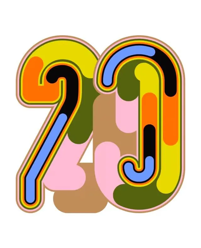
A playful illustration of the numbers 2 and 0 formed from stacked, colorful curved shapes with thick outlines and retro rounded letterforms.
Summary
A playful illustration of the numbers 2 and 0 formed from stacked, colorful curved shapes with thick outlines and retro rounded letterforms.
Visual description
The numerals are constructed from overlapping organic shapes in a palette of yellow, orange, olive green, tan/brown, pink, and blue. Each digit has a thick, high-contrast outline (yellow, orange, or black borders) creating clear separation and visual pop. The shapes stack and layer behind the numerals, creating depth and a collage-like quality. The inside of the numbers is filled with abstract rounded blobs and organic shapes in complementary warm and cool tones. The overall aesthetic is bubbly, cheerful, and decidedly retro, with a handmade or playfully illustrated quality despite crisp digital execution.
Key takeaway
The thick-outline technique creates bold legibility and a retro pop-art feel. Layered, overlapping shapes behind the letterforms add dimension and visual interest without becoming chaotic. The color palette balances warm (yellow, orange, brown) and cool (blue, green) tones in a way that feels playful rather than jarring.
Reuse notes
Perfect for anniversary campaigns, playful branding, event graphics, or contexts where retro-fun energy fits the message. Works well at large scale and in print. The rounded letterforms and bright color suggest youth-facing brands, creative studios, or companies leaning into nostalgia. Avoid using in contexts requiring formality or minimalism. The wordmark-style density means it functions best as a standalone graphic rather than body typography.
More like this
Keep what you find
A free account saves references to boards and can send you a weekly email of picks based on what you save.
To see every result, go Pro.