Preview image. Unlock full-res
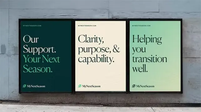
Three black-framed posters arranged horizontally, each with a distinct muted color field and sans-serif service messages, unified by consistent typography hierarchy and the McClessman logo.
Summary
A three-panel poster installation each with a discrete muted background color and sans-serif service statement, unified by consistent grid-based layout, framing, and the McClessman logo.
Visual description
Three black-frame posters mounted horizontally on white wall. Left panel: deep teal background with white text "Our Support. Your Next Season" stacked vertically, logo below. Center panel: warm off-white background with black serif text "Clarity, purpose, & capability" and logo. Right panel: soft sage green background with black text "Helping you transition well" and logo. Each panel features generous white space, clean sans-serif or serif typography in a clear hierarchy, and consistent black frame width. The overall effect is serene, organized, and deliberately paced for contemplation.
Key takeaway
The muted color-per-statement approach avoids visual clutter while creating distinct memorability; the negative space around the text invites the viewer to slow down; using service language (clarity, support, transition) instead of brand claims feels consultative rather than promotional.
Reuse notes
Ideal for professional services, life coaching, therapists, or consulting brands that want to communicate calm expertise. The three-statement approach works well for brand pillars or service tiers. Colors read sophisticated and approachable; small serif details elevate the professional register. Wall installation scales the message; reduce to poster triptych for print collateral.
More like this







Keep what you find
A free account saves references to boards and can send you a weekly email of picks based on what you save.
To see every result, go Pro.