Preview image. Unlock full-res
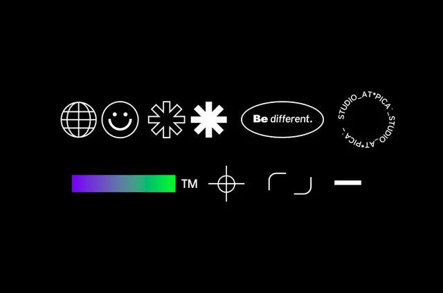
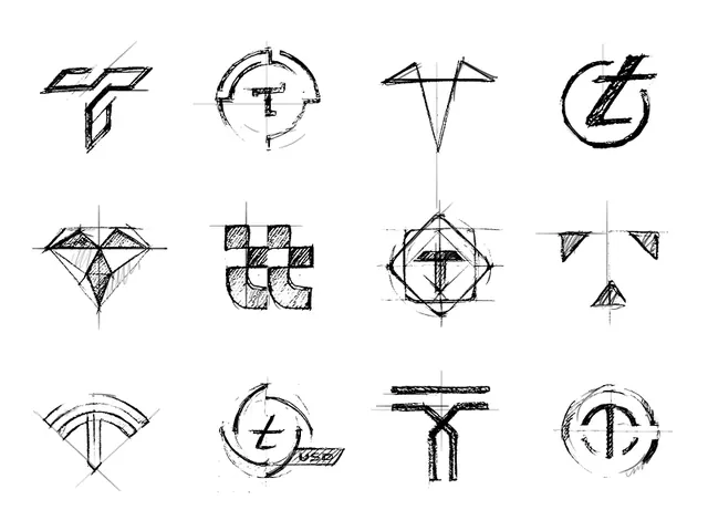
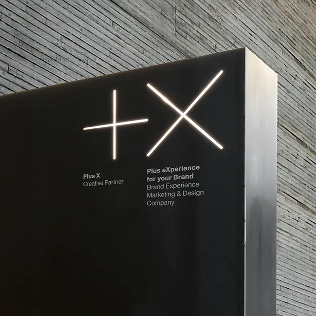
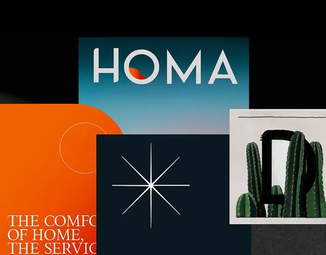
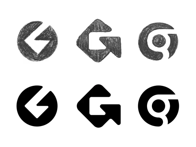
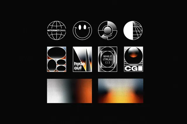
A black-background collage of monochrome identity explorations with geometric logo marks, boxed compositions, and orange-to-blue gradient studies.
Summary
A black-background collage of monochrome identity explorations with geometric logo marks, boxed compositions, and orange-to-blue gradient studies.
Visual description
The image shows a centered grid of small identity experiments on a black textured background. The top row contains circular logo marks, the middle row contains boxed logo compositions with text and symbols, and the bottom row contains two wide gradient panels with halftone texture.
Key takeaway
Use a strict black field with bright white linework so the forms feel precise and premium. Mix circular geometry, boxed frames, and a few warm gradient accents to keep a minimal identity system from feeling sterile.
Reuse notes
This works well for branding moodboards, identity presentations, or logo exploration pages where structure matters more than narrative. Reach for it when you want a controlled, high-contrast look with a speculative design-studio feel.