Preview image. Unlock full-res
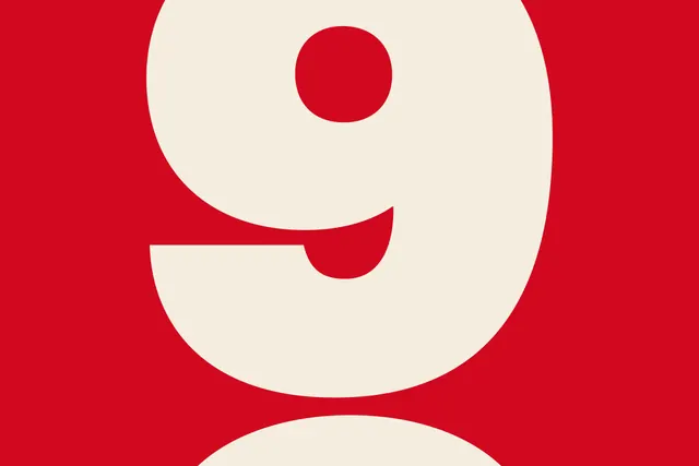
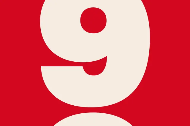
A minimalist mark made from a single numeral '9' rendered in soft off-white with a deep red background, achieving bold visual impact through pure geometric contrast.
Summary
A minimal logo composed entirely of the numeral '9' rendered in soft off-white against a bold deep-red background, expressing identity through pure typographic form and extreme color contrast.
Visual description
A centered, large-scale numeral '9' in a clean, medium-weight sans-serif occupies most of the composition. The letter is rendered in a soft warm white or cream tone (#F6ECE2). The background is a saturated, deep red (#D3071E), creating immediate visual tension. The 9's form fills the available space without touching the edges, allowing the red to frame it. The shape is geometric and slightly condensed, with no serifs or decorative details. The overall effect is stark and direct.
Key takeaway
The power of a single, legible typographic form as a complete logo. The intentional pairing of warm tones (off-white and red) creating rhythm rather than flatness. The simplicity that allows the mark to scale from tiny (favicon) to mural-size without loss of impact.
Reuse notes
Works well for startups, tech companies, or anyone needing a fast-recognizable mark. The numeral approach is clever for version numbers, iterations, or companies with numeric identities. Test at small sizes (16px) to confirm legibility. The red-and-cream pairing reads expensive and confident; it pairs well with minimalist sans-serif secondary type.