Preview image. Unlock full-res
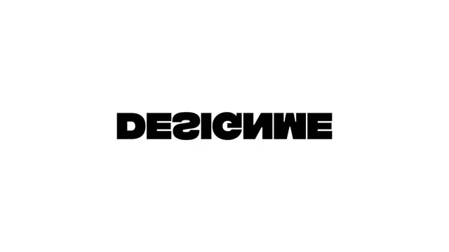
Bold, geometric wordmark with mirrored/reversed letters in a heavy sans-serif typeface.
Stylegeometric
Colordark, light, monochrome, muted, high-contrast
Typesans-serif, all-caps
Moodprofessional, bold
Industryagency
Tagsmirrored, symmetry, wordmark, typography-driven, design-focused, One word, Letterform, Sans-Serif, Uppercase, Bold, Unique, Corporate, symbol-text, wordmark: DESICNNE, monochromatic, neutral
Palette
#FFFFFF
#000000
#9C9C9C
Summary
Bold, geometric wordmark with mirrored/reversed letters in a heavy sans-serif typeface.
Visual description
The logo consists of the word DESIGNWE in a bold, black, sans-serif typeface on a white background. Several letters are mirrored or inverted, specifically the D, S, G, and E. The letterforms are thick with uniform stroke weights and squared edges.
Key takeaway
Use mirrored or flipped characters within a word to create a symmetrical, geometric pattern while maintaining legibility.
Reuse notes
Reach for this when designing a logo for design studio, agency. Pairs with modern, bold identity systems. Original by Damian Chmiel.