Preview image. Unlock full-res
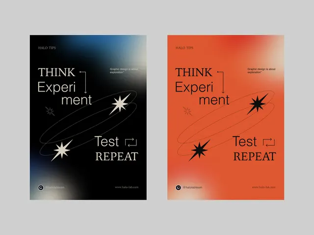
Two matching posters using minimal sans-serif typography with abstract star icons, one rendered in deep blue-to-cream gradient, the other in burnt orange-to-cream, each declaring THINK Experiment and Test REPEAT.
Summary
Two vertically oriented posters in a symmetrical pair using high-contrast minimal typography and an abstract star icon, one in a blue-to-cream gradient and the other in burnt-orange-to-cream, both declaring THINK Experiment and Test REPEAT in layered sans-serif type.
Visual description
The left poster uses a deep blue-to-light-cream gradient background. The right poster mirrors the layout but uses a burnt-orange-to-cream gradient. Both feature the same typography hierarchy: THINK in small caps at top-left, Experiment broken across two lines in larger display type (with mixed font weights), a small abstract two-point star icon in white, then Test in a minimal sans-serif and REPEAT in all-caps serif or slab type, bottom-right. The color fields are flat gradients with no additional texture. Small footers contain source attribution and metadata. The overall effect is structured, geometric, and clearly experimental in intent.
Key takeaway
Symmetrical color-variant pairs show a system clearly and are memorable together. The breaking of Experiment across lines (Em / peri / ment) with THINK and Test creates unexpected hierarchy. Abstract geometric icons (the star shape) anchor compositions without needing illustration. Using all-caps serif for a single word (REPEAT) against a sans-serif system adds emphasis without adding a typeface.
Reuse notes
Reference for research institutions, scientific branding, or conceptual design systems needing clarity and visual boldness. The poster format (vertical, dense typography, single icon) is effective for exhibitions or process documentation. The two-color variant approach works for systems needing flexibility (light mode / dark mode, or two brand expressions).
More like this






Keep what you find
A free account saves references to boards and can send you a weekly email of picks based on what you save.
To see every result, go Pro.