Preview image. Unlock full-res
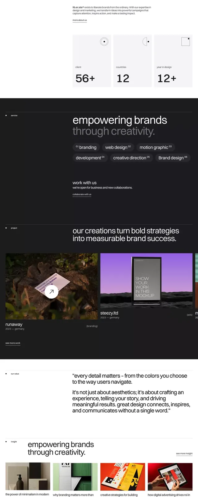
Liberate brand identity website featuring dark-background layout with cream typography, earthy color palette, and lifestyle imagery integrated into sections on brand empowerment.
Summary
Liberate brand system presented as a dark-background website showing creator-empowerment messaging, muted color palette, and lifestyle photography.
Visual description
A dark navy-black background with cream and light gray typography dominates this brand presentation. Sections scroll vertically, each introducing a brand pillar: "Empowering brands through content strategy," "50+ creators," "12 content pillars," "12+ strategic initiatives." Lifestyle photography (outdoor scenes, product detail shots) sits adjacent to text blocks, breaking up the visual weight. A dedicated color-palette section displays swatches in muted purple, teal, and warm neutrals against the dark ground. Small body text in light gray provides supporting copy. The logotype "liberate" appears in the corner in a minimal sans-serif. Stat figures (56+, 12, 12+) sit as large numerical callouts, creating visual hierarchy. Generous whitespace and left-aligned text blocks keep the layout breathing despite the dark background.
Key takeaway
The systematic approach to dark-background branding: dark enough for premium perception, but light enough text for legibility without white bleeding. The color palette is restrained (4-5 colors) yet feels lived-in because of the natural imagery. Stat callouts using large numerals with minimal context create scannable interest. The vertical scroll structure naturally reveals the brand story in digestible sections.
Reuse notes
Works for creator-economy, agency, or content-marketing brands targeting a young professional audience. The muted, earthy palette reads as thoughtful and sustainable. Best with supporting lifestyle or product photography; avoid pairing with illustrative or icon-heavy design.
More like this






Keep what you find
A free account saves references to boards and can send you a weekly email of picks based on what you save.
To see every result, go Pro.