Preview image. Unlock full-res
Elegant handwritten cursive script rendered in thin, continuous line strokes suggesting a personal signature or luxury brand mark.
Summary
Minimalist wordmark built from delicate, continuous cursive letterforms drawn in thin black line strokes, evoking hand-calligraphy and personal artistry.
Visual description
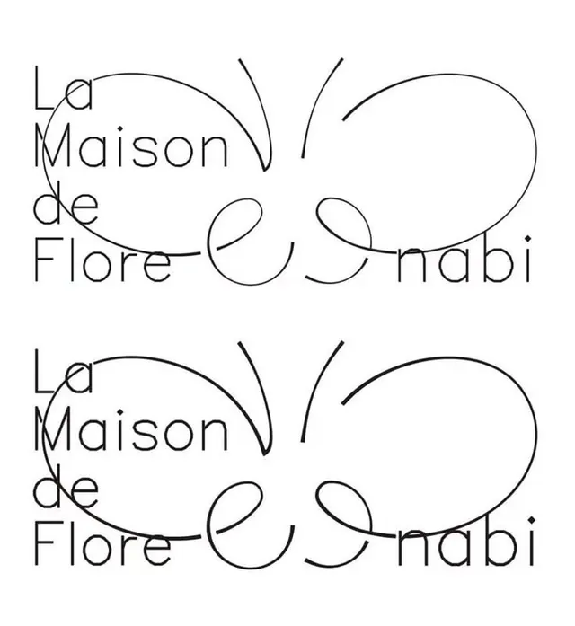
Two identical stacked examples of a flowing script wordmark in thin black lines on a white background. Each letter connects fluidly without lifting the pen, creating long elegant curves with minimal thick/thin contrast. The word reads naturally as script calligraphy, with generous letter spacing and letterforms that sit upright and balanced. The line weight remains consistent throughout, suggesting a precision instrument rather than a brush.
Key takeaway
The confidence of a continuous-line approach: no serifs, no flourishes, just the letterforms themselves carrying all personality. This economy forces disciplined letterform design and reads as premium through restraint rather than decoration.
Reuse notes
Ideal for luxury brands, high-end hospitality, editorial houses, and invitation design. Works best at medium scale or larger; at small sizes the delicate line weight can disappear. Works on light backgrounds primarily; reverse versions need careful ink-to-space ratio testing.