Preview image. Unlock full-res
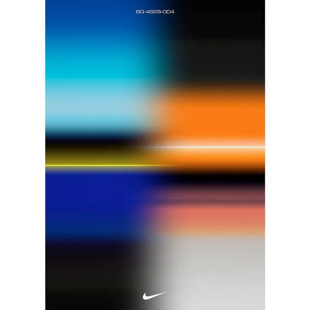
Color palette specification sheet showing horizontal gradient bands transitioning across cool-to-warm spectrum with Nike Swoosh baseline identifier.
Summary
A color specification sheet displaying six horizontal gradient bands transitioning from cool (deep blue, cyan, teal) through warm (orange) back to dark and neutral tones, stamped with a product identifier and the Nike Swoosh.
Visual description
Six full-width horizontal bands each containing a smooth color gradient. The top band shifts from deep blue through navy to black. The second moves from cyan-blue across peachy-orange. The third is a narrow bright line. The fourth transitions deep blue to soft coral. The bottom band fades deep navy to light gray-white. Each band demonstrates how colors shift and blend rather than stopping at discrete values. The Nike Swoosh sits centered at the bottom in white. A reference code "BQ 4629-004" in monospace type appears at the top.
Key takeaway
The use of continuous gradients rather than flat swatches to show how brand colors behave and interact. Six carefully chosen bands demonstrate both cool and warm temperature ranges while maintaining visual rhythm. Minimal typographic treatment keeps focus on the palette.
Reuse notes
Effective as a brand color specification when the goal is to show gradient ranges and color transitions rather than fixed hex values. The banding approach works for athletic, outdoor, or dynamic brands. The horizontal format is compact for documents or presentations.
More like this





Keep what you find
A free account saves references to boards and can send you a weekly email of picks based on what you save.
To see every result, go Pro.