Preview image. Unlock full-res
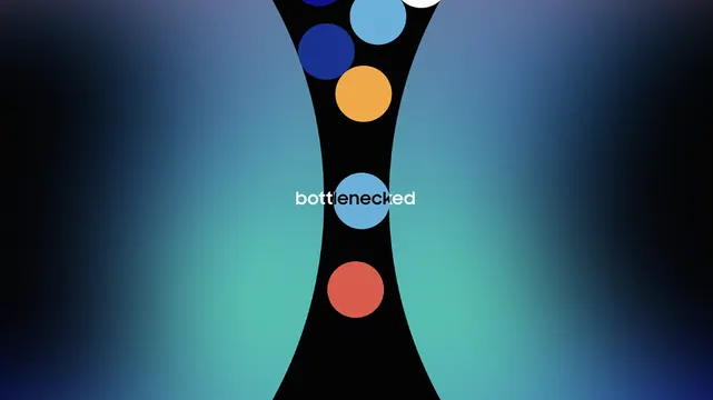
A minimalist vertical mark: four colored circles (orange, teal, red, deep blue) nested downward in a funnel shape, anchored by a teal monocolor wordmark, set against a dark blue-to-black gradient.
Summary
A minimalist vertical logo mark composed of four colored circles (orange, teal, red, blue) nested downward in a funnel, anchored by a teal monocolor wordmark on a dark gradient background.
Visual description
Four evenly spaced circles stack vertically and decrease slightly in scale as they descend, creating a funnel or tapering effect. The top circle is orange, second is teal, third is coral red, bottom is deep blue. The circles are pure saturated hues against a subtle blue-to-black radial gradient that suggests depth and roundness behind the mark. Below the circles sits a small wordmark in teal sans-serif (likely a client name or entity), positioned center. The entire composition is highly legible at small scales and reads clearly in monochrome (the wordmark is teal, circles are colored).
Key takeaway
The funnel geometry—stacking and tapering—creates a visual metaphor for focus, filtering, or distillation, useful for SaaS, analytics, or AI products. The gradient background is subtle but elevates the mark from flat to dimensional. The pairing of a symbol (the funnel) with a colored wordmark is modular: the mark works standalone, the lockup works for full branding.
Reuse notes
Excellent for fintech, data tools, AI, and analytics brands where the concept of filtering, prioritization, or funnel-shaped workflows align with product function. The cool palette (deep blue, teal) reads as trustworthy and technical; the warm orange adds energy. Avoid if your product is warm-branded or retail-focused. Works at all sizes; the stacked circles are distinct even at favicon scale.